Projects keep growing more and more complex, and as they do, so do the responsibilities of the people who manage them. Project management charts are vital for first understanding project data yourself and then for communicating that data effectively to others.
Charts also play a part in establishing the value of project management. Project management is a deeply important discipline, but it can sometimes be challenging to see that value visually. Charts can go a long way in showing this value in a way that everyone can understand.
Below we’ll show you 12 essential project management charts, plus where to use each one.
What is a project management chart?
A project management chart is any visual display of data that explains, forecasts, reports on, or organizes a project. Project management charts take a wide range of forms, shapes, and sizes. Some types of charts deal with project planning while others track progress, show cause and effect, or help with data visualization. Some charts display the entire project, while others focus on only a small portion.
One quick note: Charts are helpful, but only within context. If you’re not familiar with project management as a discipline, start with our complete project management guide before diving into specific chart types.
What to look for in a project management chart
There are dozens of chart types in the world of project management, each with its own purpose. Using the right chart for the right purpose can be almost magical in the way it can gather everyone behind a shared vision for a project.
But it’s not always obvious which chart type to use in which situation.
So, how do you know what the right project management chart is for the moment? Look for one that accomplishes at least these three benefits for you and your team.
Provides insight into the project scope
Many project management charts, including the Gantt chart, go far beyond showing timelines or completion percentages or other narrowly focused stats. They reveal the scope of work within the project, laid out over time or allocated to specific resources. In this way, they provide valuable, at a glance visibility into the scope and shape of a project.
The right chart for any specific scenario is usually the one that provides the most valuable insight for the task or challenge at hand. Often, project scope is an essential element, which is why Gantt charts tend to be so popular.
Improves your efficiency, regardless of team size
Charts are all about taking project data and turning it into something visible, something people can digest with their eyes. A project timeline may seem terribly muddled when discussing verbally or reading it in prose document form. But spread that timeline across a wall (or a shared screen), and most team members gain instant clarity on what the timeline means for them.
This has massive ramifications for efficiency: Without a visual, a team could discuss a project timeline for 30 minutes, an hour, maybe even longer, and still not have a clear shared understanding of what that timeline looks like or means. Or the project manager can throw a visual timeline up on the wall, and everyone understands almost instantly, with a much higher degree of clarity.
This is true regardless of team size — a team of just a few people can struggle with clarity and efficiency just like a larger team does. Team size can add additional complexity, but teams of any size can benefit from efficiency improvements.
Helps team members collaborate and provides better transparency
Many project management charts are essential tools for team member collaboration. They reveal who’s responsible for what, and in what order tasks and subtasks are supposed to occur. They also show team members and managers alike who’s accountable for each task.
Better transparency and better collaboration often go hand in hand. With less confusion about who’s responsible for what and how the various tasks and steps fit together, team members know who to ask for help. Sometimes there’s an even more powerful motivator at the individual level — the knowledge that “everyone else will know if I fail to deliver on one of my tasks.”
12 best project management charts
We’ve rounded up 12 of the best types of project management charts in the list below. You may already be familiar with a few of these, but unless you’re a seasoned pro project manager there’s something to learn here!
As you work through this list, keep brainstorming for where in your team’s processes these charts could be helpful.
1) Gantt charts
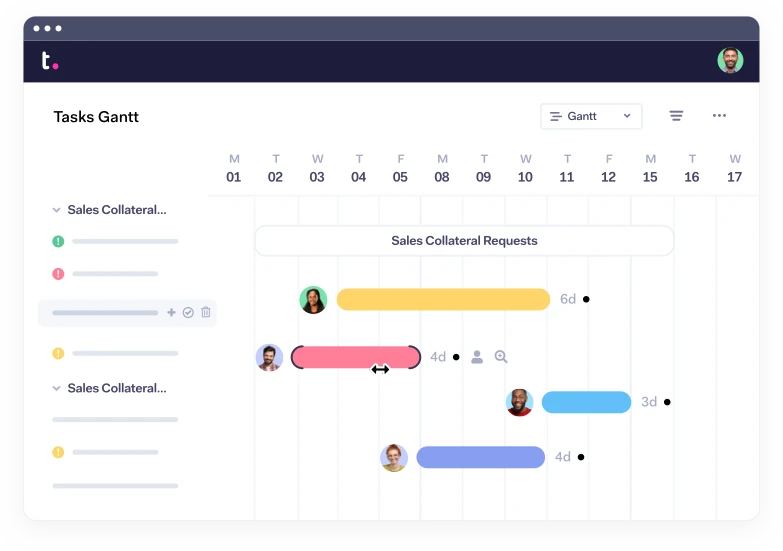
One of the most well-known and widely used project management charts, the Gantt chart is a souped-up, data-driven bar chart named after its creator, Henry Gantt. It shows projects over time, with weeks or months moving left to right along the x axis. Running top to bottom along the y axis you’ll typically see project elements: tasks, project phases, deliverables, etc.
Gantt charts allow users to set up and show task dependencies, map out milestones, identify the critical path, and track project progress. Just about every project management system in existence supports Gantt charts to some degree, and the format works especially well for organizations building out projects in Microsoft Project.
Gantt charts show up in numerous project management methodologies and tend to be used most frequently with longer, more complex projects. Modern web-based implementations (such as what you’ll find in Teamwork) tend to be scalable and zoomable, allowing users to quickly zoom out to the big picture or into a more granular level of detail.
You’ll find rich support for Gantt chart formats throughout the Teamwork suite. We’ve even gone a step farther and created a standalone Gantt chart maker — 100% free for existing Teamwork users. Check out Teamwork’s free Gantt Chart Maker and start creating beautiful, data-rich Gantt charts today!
Best for
Gantt charts are best for project management methodologies that use the critical path and for projects with overlapping components or task dependencies. They also perform especially well as a project-wide visual tool that gets team members and stakeholders aligned on a shared vision of the project and project timeline.
When coupled with a solid work plan and a capable project management tool, online Gantt charts can also help to automate progress reporting.
For more on using Gantt charts with existing Teamwork project data, check out a related post: Viewing your project in a Gantt chart.
Pros
Powerful way to visualize an entire project
Strong support for task dependencies
Can provide an effective way to track progress (and automate reporting, if connected
Pulls all tasks and subtasks into a central location (single source of truth)
Cons
With longer projects (where Gantt charts are most helpful), they can grow beyond what can be viewed on one screen (or printout)
Can be more complicated to create (though online tools like our Gantt Chart Maker help)
Highly data-dependent, requires quality data and clear information
2) Work breakdown structure diagram (WBS)
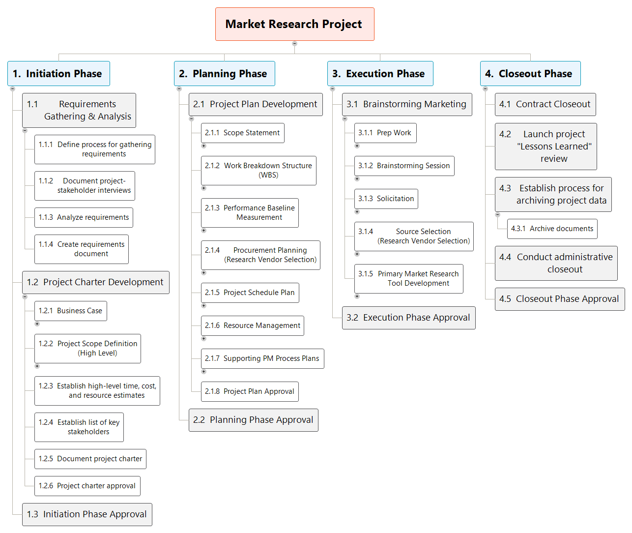
A work breakdown structure diagram (WBS) looks almost exactly the same as an organizational chart (org chart), but instead of a CEO at the top and executives at the next level down, you’ll find projects.
Imagine that each individual project is the CEO of its own chart, with high-level phases or specialties or deliverables as the top-tier executives. Below those, you’ll find categories or initiatives, and below those, more detailed responsibilities and tasks.
Best for
The WBS format is a great way to get a sense of the work or departments involved in a project, and the format is fairly flexible. If a project is especially large and simply getting a handle on what work is involved seems daunting, using a WBS could be a first step toward understanding and scheduling the project.
Work breakdown structure diagrams work best for projects with distinct phases, tasks, and subtasks that all belong clearly within a hierarchy. If putting tasks or responsibilities into hierarchical buckets is important, WBS is a good way to do so.
That said, there are significant limits here: WBS diagrams don’t show dependencies, task order, or project timelines. They don’t usually allow for assigning tasks to individuals. They can be powerful in understanding a project at a high level, but they usually won’t be the working document that informs who does what and when.
Pros
Can show task hierarchy in a clear, easy to understand way
Breaks down large projects and shows which groups are responsible for which areas
Helps project managers and leaders avoid overlooking or forgetting about specific tasks or deliverables
Goes deeper or more granular than a work plan and can be a powerful complement to it
Cons
Cannot display task relationships or dependencies
No sense of timeline
Cannot show a linear progression or task order
Cannot be used as a task reporting structure
3) Flow chart

Flow charts are another format that most of us have come across even outside work contexts. They can accomplish a lot within projects, as well. As a refresher, a flow chart shows the progression of a project or process using boxes and other shapes connected to one another with lines and arrows. Some flow charts use color, fill, multiple line and arrow types, and so on to communicate additional details.
Best for
Flow charts allow users to show complicated relationships between tasks and steps, but usually only at a fairly local level. Mapping out a months-long project with a hundred tasks will likely create more confusion than it resolves, and the process of building the chart will take too much time and effort.
Flow charts work best for smaller projects or portions of projects that have a higher level of complexity or interrelatedness. They can pair well with higher-level formats like Gantt charts, where the other format shows the entire project and the flow chart reveals more detail about a particularly knotty section of the project.
Pros
Visually represents the relationship between tasks
Allows for representing more complicated project workflows and task relationships
The use of color and other elements allows for communicating layers of information
Cons
There’s a limit on how large of a project makes sense to flow chart
Doesn’t easily show project timeline or task durations
Colors and line types don’t have consistent meanings (consider including a legend)
4) Kanban board

An essential part of any agile or scrum workflow, the Kanban board displays tasks as cards on a board, typically organized into columns that reflect task status (think To do, In Progress, Review, and Complete). Nearly all Kanban boards are cloud-based and interactive, allowing teams to assign tasks to individuals and run those tasks through predefined workflows.
Kanban boards are a powerful and quick system for agile or rapid-fire workflows where task progression is uniform and each task is well understood (or defined elsewhere).
Best for
Kanban boards are best for agile, flexible teams with fast-moving deliverables and projects that can break down into short-range workflows. They work well in pull-based workflows, where there’s an ample supply of available tasks that any relevant team member can pick up. Content marketing, web development, design, and numerous other creative fields often choose Kanban.
Teamwork has a fantastic Kanban Board view that helps teams like yours map out workflows, automate processes, and gain effortless project visibility. With Teamwork, you can create triggers to automate Kanbanworkflows, reassigning tasks and changing due dates automatically. And boards are fully customizable, so you can make them do what you need them to do. Get started with Teamwork’s Kanban board view now.
Pros
Extremely flexible system that cuts out a lot of clutter
Easy to see at a glance where various tasks or deliverables are
Automated trigger-based workflows mean the work keeps moving—no manual notifications required
Supports agile, scrum, scrumban, and other hybrid agile systems
Cons
Flexibility is limited to the Kanban system (no tables, no timeline, no grid or list views)
Does not support critical chain or task dependencies well
No timeline view
Hard to get a sense of resource allocation
5) PERT chart
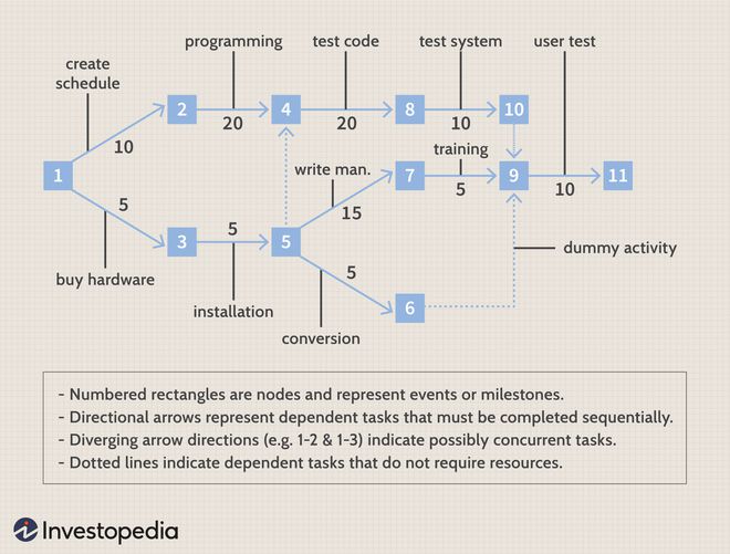
PERT charts are a popular, if old-school, choice in project management. PERT is an acronym for program evaluationreview technique, the methodology the chart is based on. PERT charts show task dependencies first and foremost, represented by arrows between the various nodes (circles or rectangles) on the chart.
These charts are similar to flow charts, but with branching paths used to indicate parallel workflows. Another key difference is that PERT charts use arrows for tasks and nodes for milestones, where flow charts use the nodes for tasks and the arrows to simply show direction through time.
Best for
PERT charts are best for complex projects where many tasks have dependencies and where projects cut across numerous departments. PERT charts can be a great way to explore various ways of structuring a project — without losing track of dependencies.
The system can be a little inflexible, though, so it isn’t ideal for projects with many unknowns and a high likelihood of process change.
Pros
Brings time and resources to the forefront
Shows dependencies between tasks
Pulls in data from multiple departments (not siloed)
Clearly reveals non-dependent events that could run in parallel
Cons
PERT charts are subjective, requiring much manual estimation
Success is not guaranteed and often depends on the experience and accuracy of the person building the chart
Since the charts are based on estimates and assumptions, they can be unreliable
Focus on deadlines and dependencies sometimes obscures project costs
6) Cause-effect project charts

Cause-effect project charts map out all potential causes and all potential effects of various scenarios or occurrences. Usually these are used in problem solving when something isn’t going well in a project. The problem is listed in the center and to the right of a horizontal line, and then various causes or contributing factors are listed out along diagonal lines.
Because of the shape these diagrams take, you may hear them called fishbone charts. They’re also named Ishikawa charts after the founder of the discipline.
Best for
Cause-effect project charts are best used for solving project problems as they occur and for brainstorming potential actions, workflows, or changes. They help teams quickly visualize contributing factors, which can lead more quickly to a solution.
Pros
Helps reveal additional root causes or contributing factors to problems
Provides a visual framework for brainstorming
When used proactively, can solve potential problems or bottlenecks before they become actual problems
Cons
Very narrow focus means its usefulness is situational
Subjective — results only as good as the team contributing
Doesn’t provide clear answers to the problem on its own; only clarifies the cause
7) Pareto chart

A Pareto chart maps out several factors in a combined bar and line graph, revealing the most common reasons for a particular event (usually a problem or project complication). The chart measures an event (late work packages, for example) and groups responses by reported cause, with the most popular cause on the left and least on the right.
Causes are represented on the chart with bars, while the line graphs cumulative total. In this way, teams can quickly see where a given percent of the problems lie, giving a sense of what to fix first.
Best for
In project contexts, Pareto charts are typically used to graph out the reasons for a project problem. The value of this chart type is in quickly displaying which reasons are most common and, cumulatively, how much of the problem you’d resolve by tackling a specific set of reasons.
Pros
Easy to generate from any spreadsheet application, including MicrosoftExcel
Quick way to map two types of data across each other
Shows what percentage of a problem would be resolved by fixing various causes
Cons
Narrow focus or singular purpose: doesn’t show the big picture of a project
Dual Y axes can be difficult to understand
Mapping the wrong sorts of information on this chart creates confusing or nonsensical results
8) Burn-up or burn-down project chart
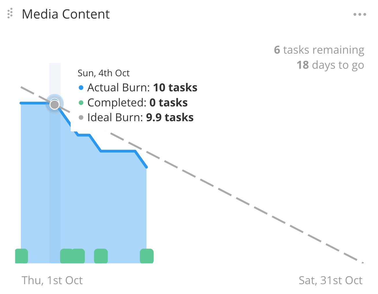
Popular within scrum methodology, burn-up and burn-down charts give a visual representation of how a team has progressed through planned work during a timeframe (usually a sprint). Burn-up charts show the increase in scope and reveal the amount of total work that’s been completed so far in a project.
Best for
Within scrum projects and sprints, these charts show when a project is likely to be completed and what work remains to be done. They are primarily used as project tracking tools.
Pros
Easy to see whether a project is on track for on-time finish
Encourages team by showing work completed thus far
Can be easily created and modified over the course of the project
Cons
Doesn’t provide insight into specific tasks
Doesn’t map out an entire project in any detail
9) Bar chart

Another classic chart format, the bar graph is an effective way to visualize a single type of data, often broken out by a particular category (such as by year, by product, etc.).
Best for
Bar charts provide quick visuals for a specific element or data point in a project.
Pros
Simple to create
Easy to understand
Can show growth or decline over time
Cons
Somewhat overly simple
Can only measure one element or aspect
Can be confusing unless properly labeled
Feels a bit like a high school report
10) Pie chart
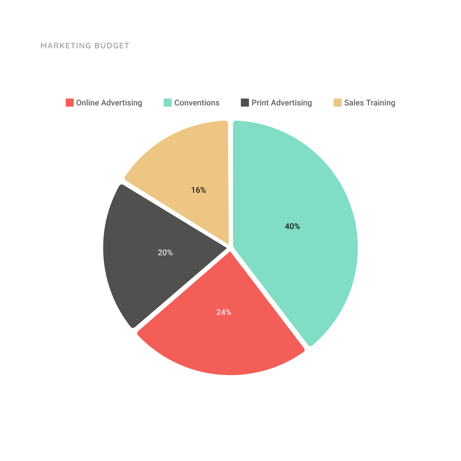
Nearly as ubiquitous as the bar chart, the pie chart shows percentages of a whole. It’s a great way to segment data and quickly visualize which slices of the pie are the largest.
Best for
Any single element that can be framed as a percentage of a whole.
Pros
Easy to create
Extremely easy to understand and digest
Shows which categories are significant and which are very small
Cons
Can only be used to display one thing
Only possible when that thing can be framed as parts of a whole
Might remind your audience a little too much of middle school
11) Control chart

A control chart shows a specific variable or process as it occurred at various points in time. If a particular task or process typically takes two hours but occasionally takes far longer (or shorter), a control chart will reveal those anomalies.
Best for
If a process has erratic changes, spikes, or outliers that need to be addressed, a control chart quickly reveals where those happened.
Pros
Quickly reveals anomalies, spikes, and outliers
Can show when a tool or resource isn’t working as intended
Can report in real time when a measurement crosses a limit line
Cons
Shows the what, but not the why (no causality)
Is susceptible to data errors, reporting errors, and the like
Used poorly, can treat human employees like machines, expecting uniformity
12) Matrix diagram
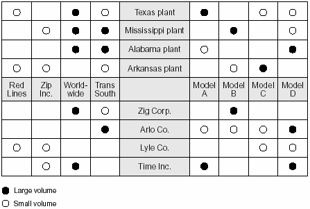
Matrix diagrams can show relationships between two, three, or four sets of data or compare multiple types of data against a common standard. They often take the shape of a quadrant with four categories running in a cross shape between the quadrants.
Best for
Showing relational information that wouldn’t map well across simpler chart types.
Pros
Highly customizable tool
Shows relationships between data points
Can reveal unexpected connections
Cons
Scope is limited
Can be difficult to read
Can be challenging to create
Create better project management charts with Teamwork
Now that you have a better understanding of 12 of the most common project management charts, it’s time to start building them!
The quality of the data feeding your charts and the tools you use to create them will make a massive difference in your end result. Teamwork provides a powerful platform both for housing project data and turning that data into the charts you need to keep teams on track.
See what Teamwork can do to transform your project management workflows — see Teamwork for project management plans, or sign up now for free and get started building better charts today!

